


MUCHO BURRITO BRAND REFRESH
In 2017, Mucho Burrito was looking for a brand refresh from their current dark, rustic, Mexican-inspired look and feel.
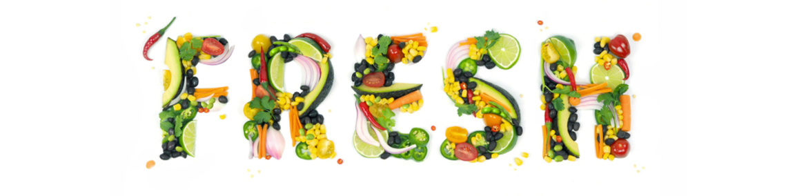
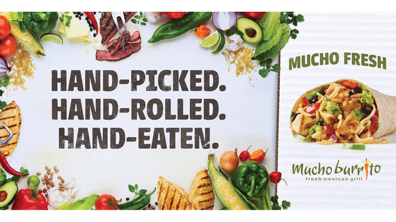
With a nimble budget, I was tasked as a recently hired Junior Art Director to communicate their new brand ethos of freshness, with a prescribed use of hand written fonts and arrows for emphasis, all while maintaining their current word mark.
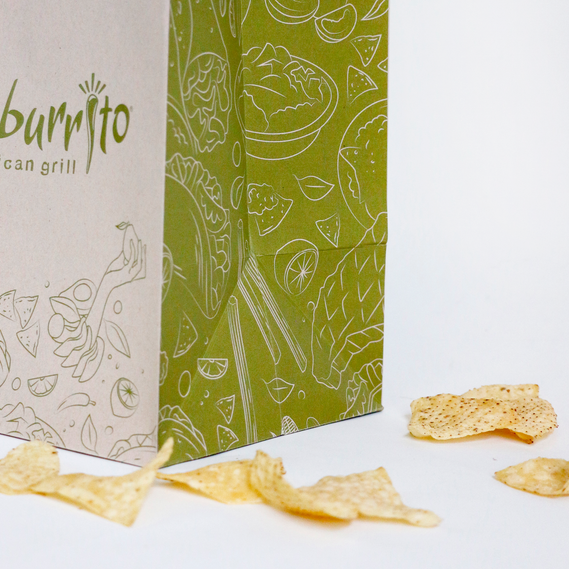
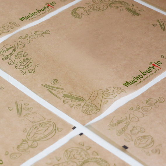
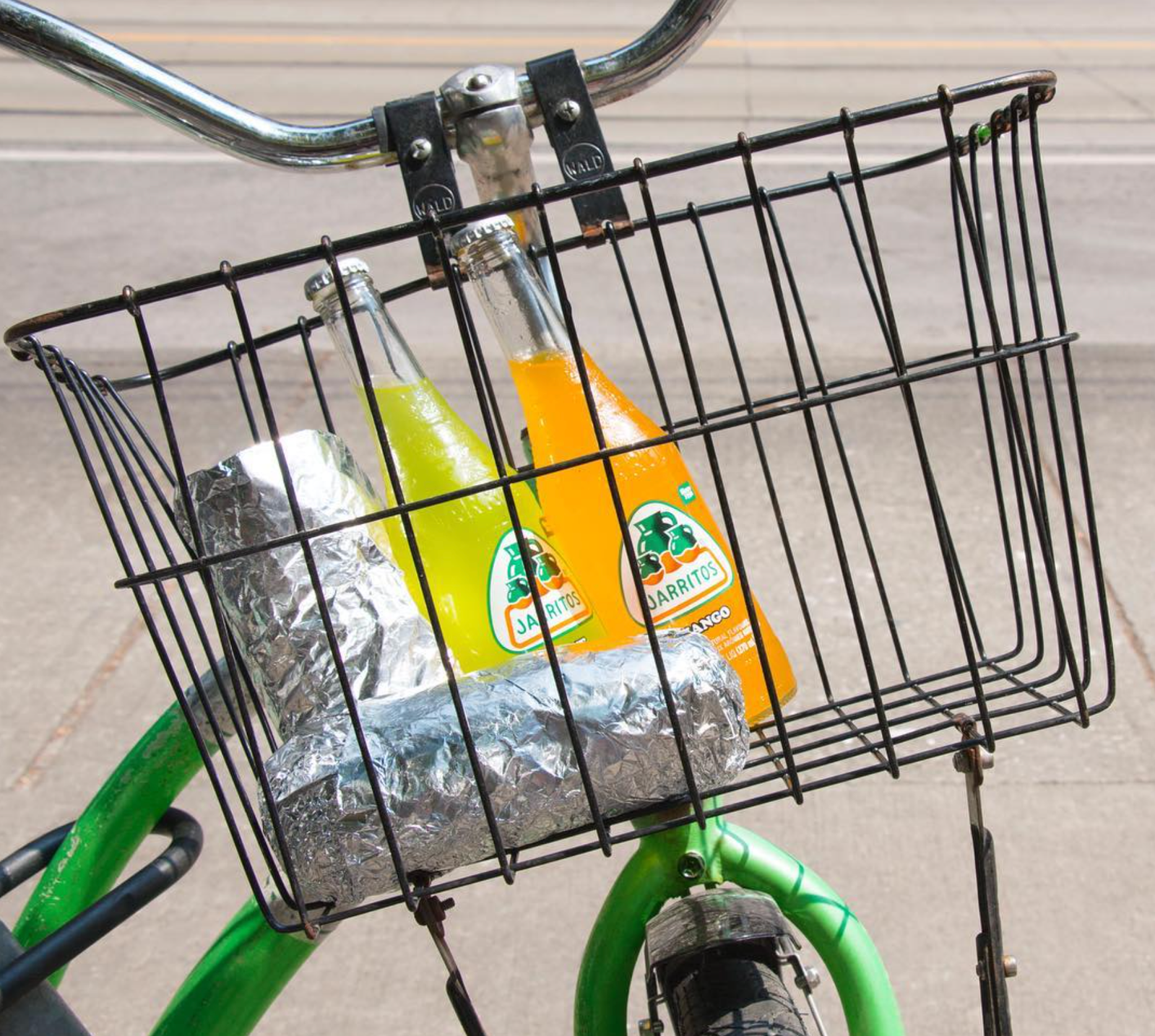
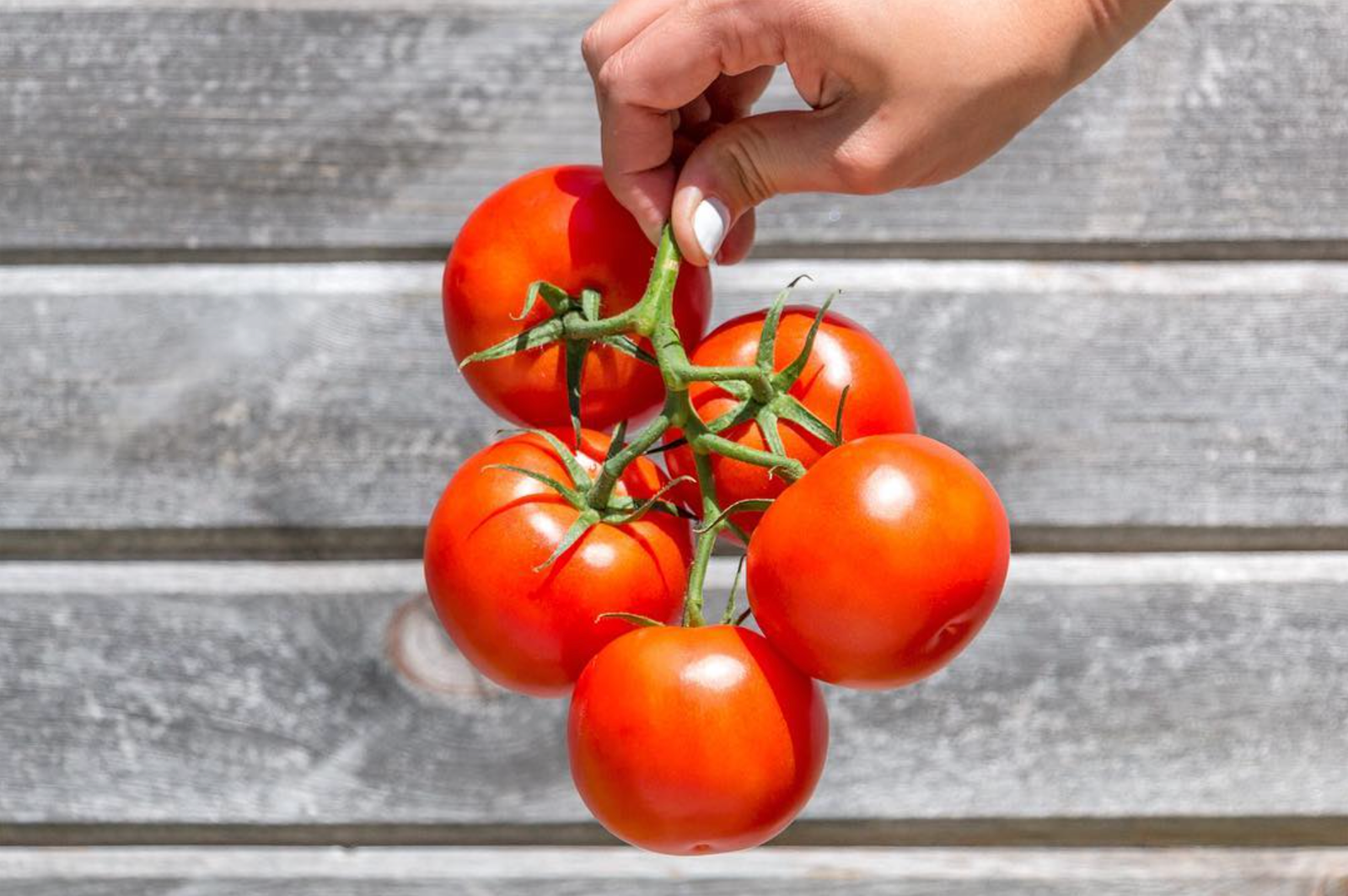
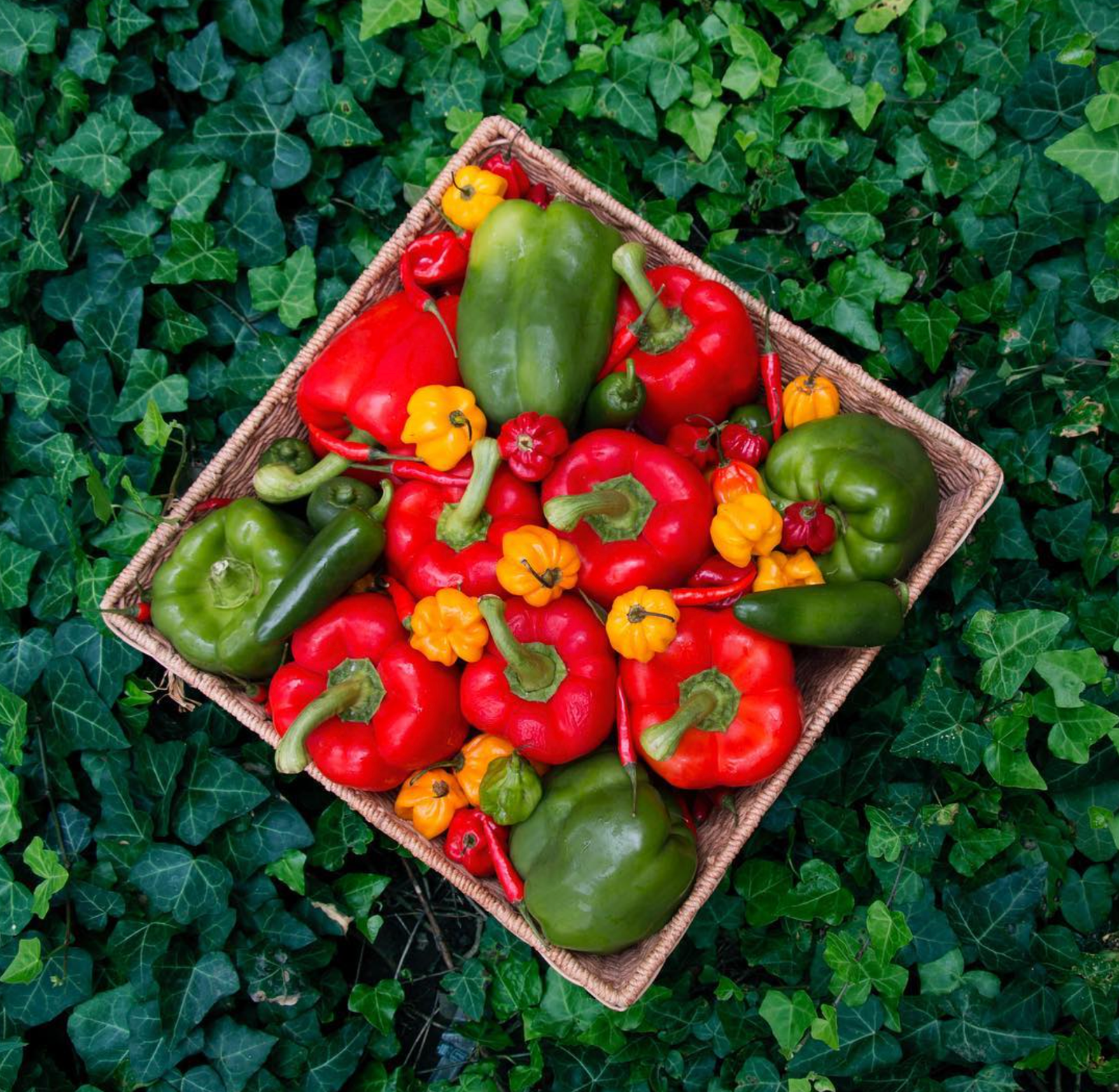
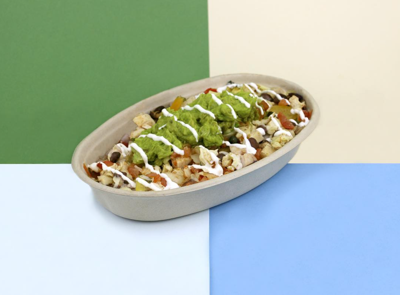
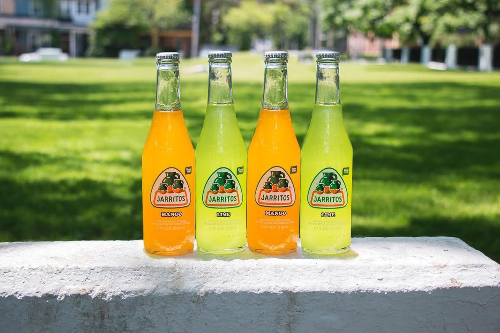
Keeping that in mind, I decided to draw and incorporate original illustrations to help tie everything together and introduced a new secondary palette inspired by the vibrant colours found in their ingredients and in nature.
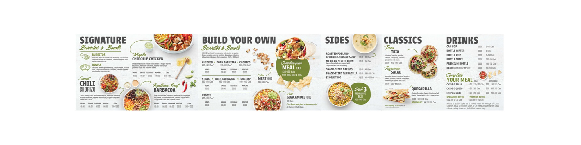
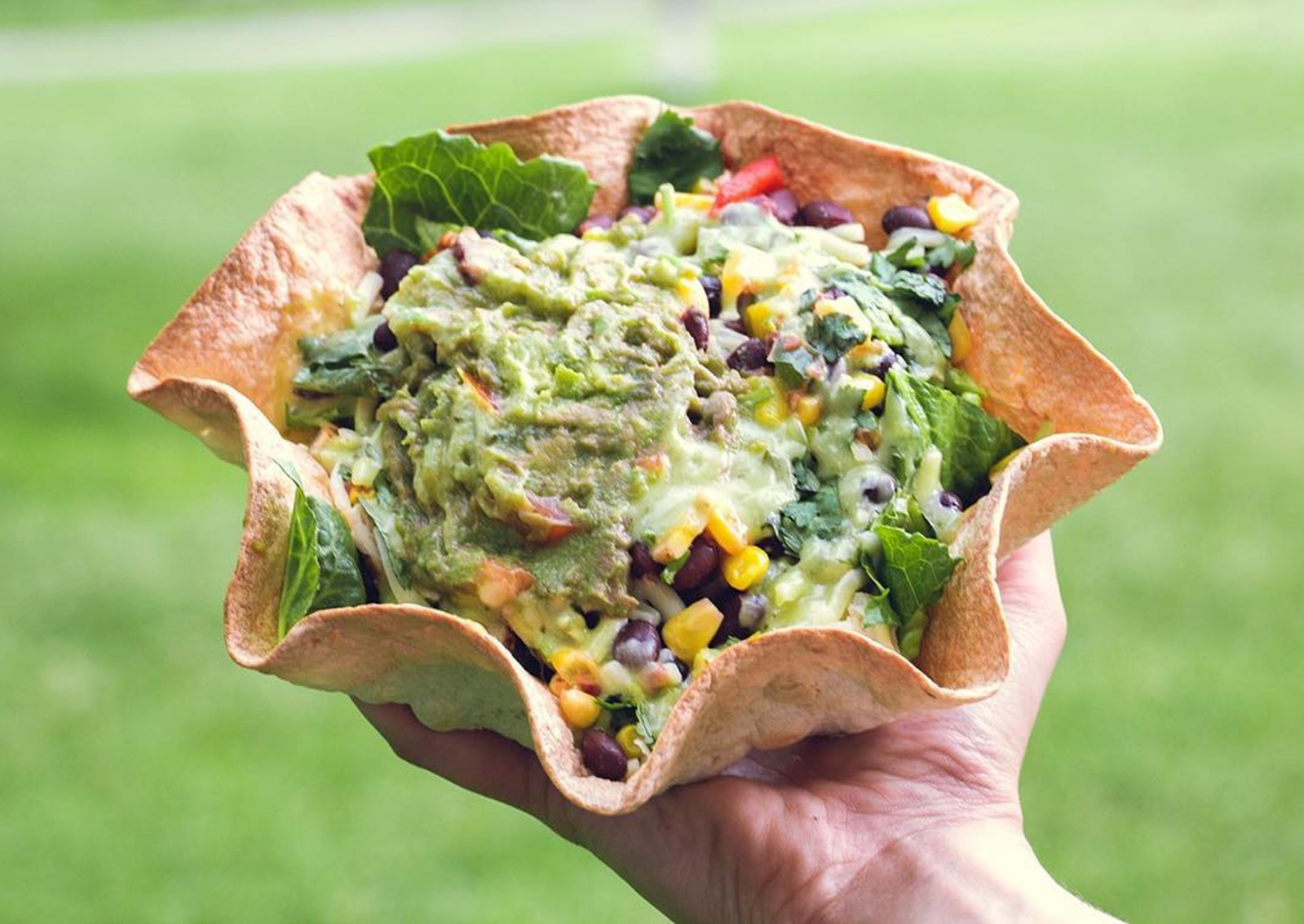
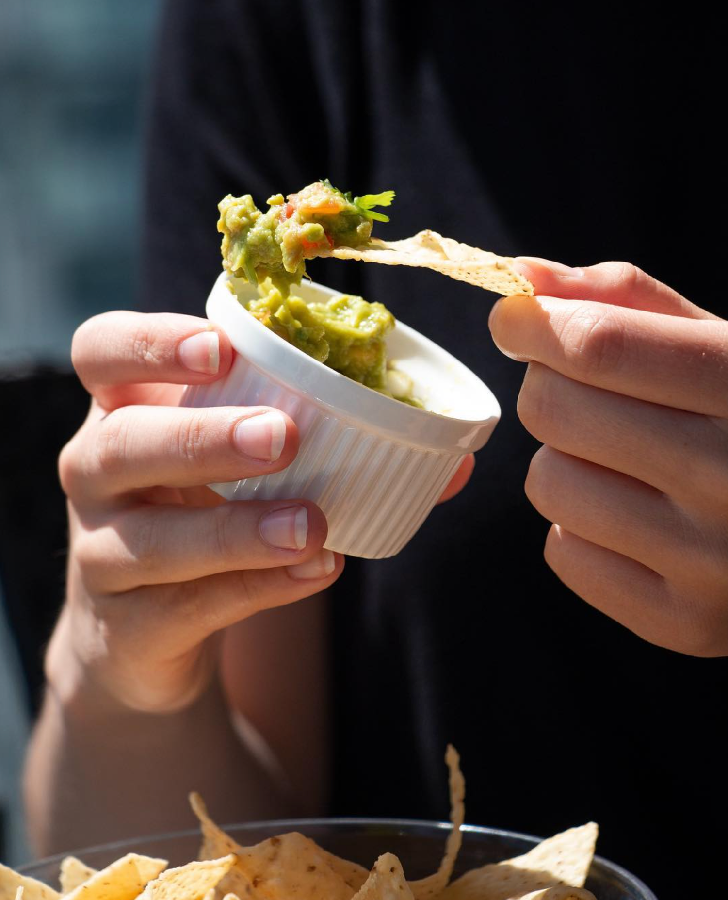
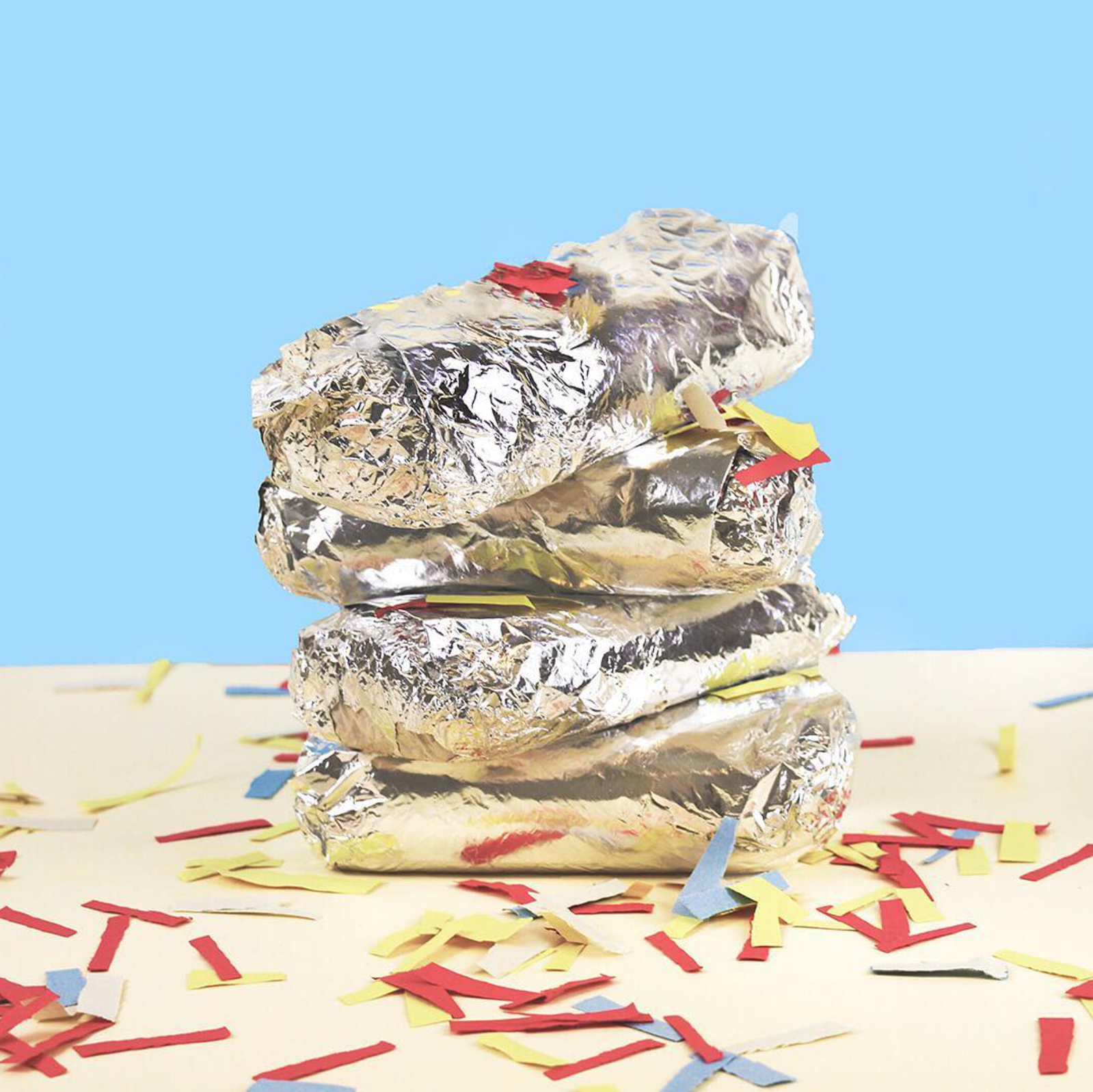
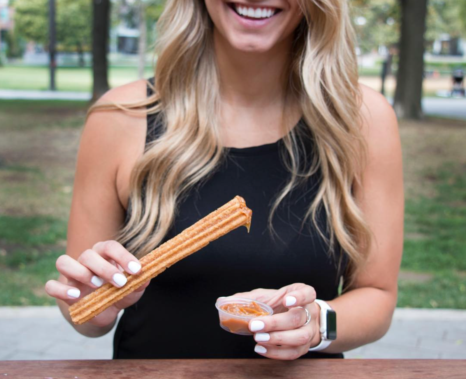
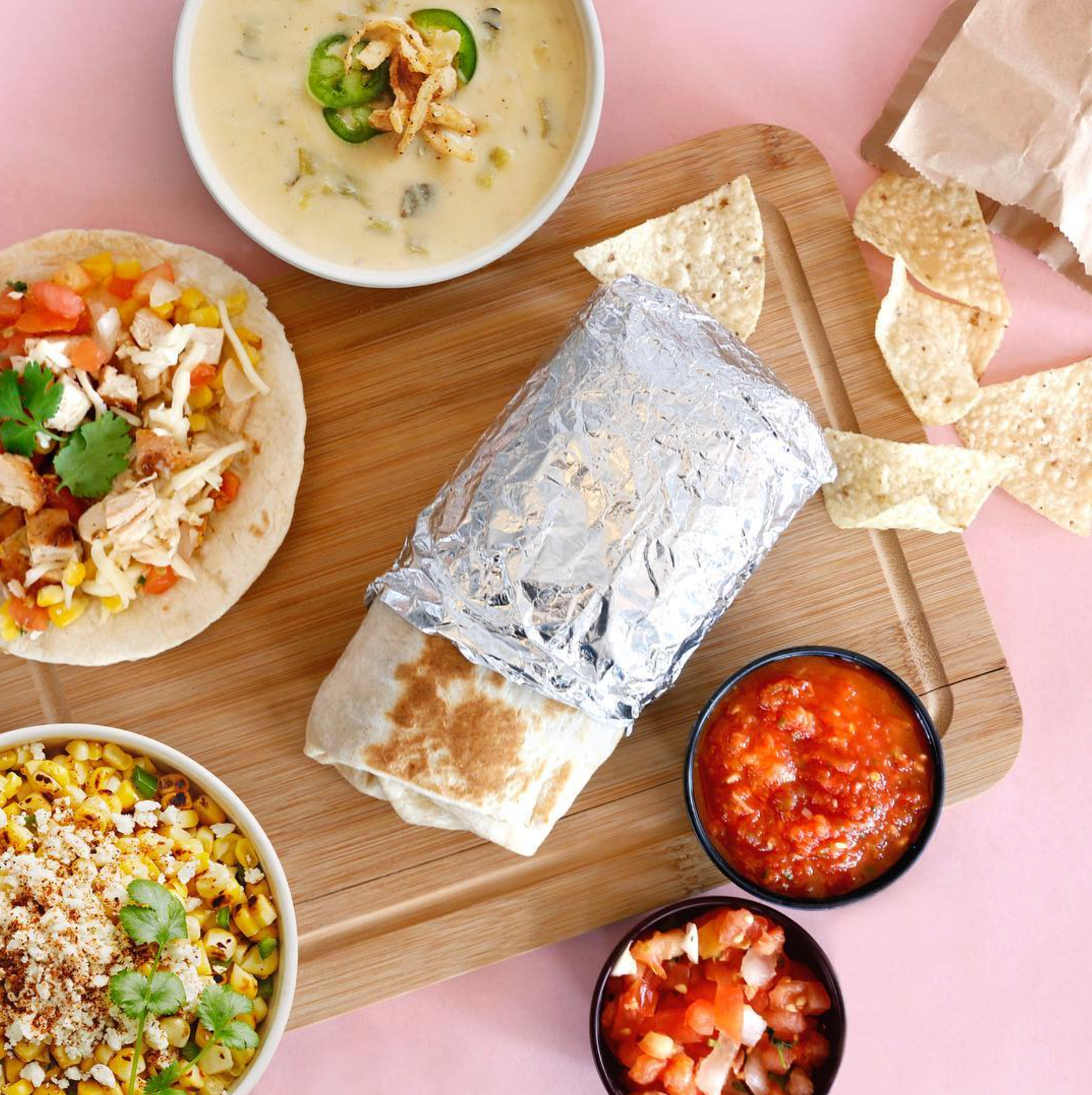
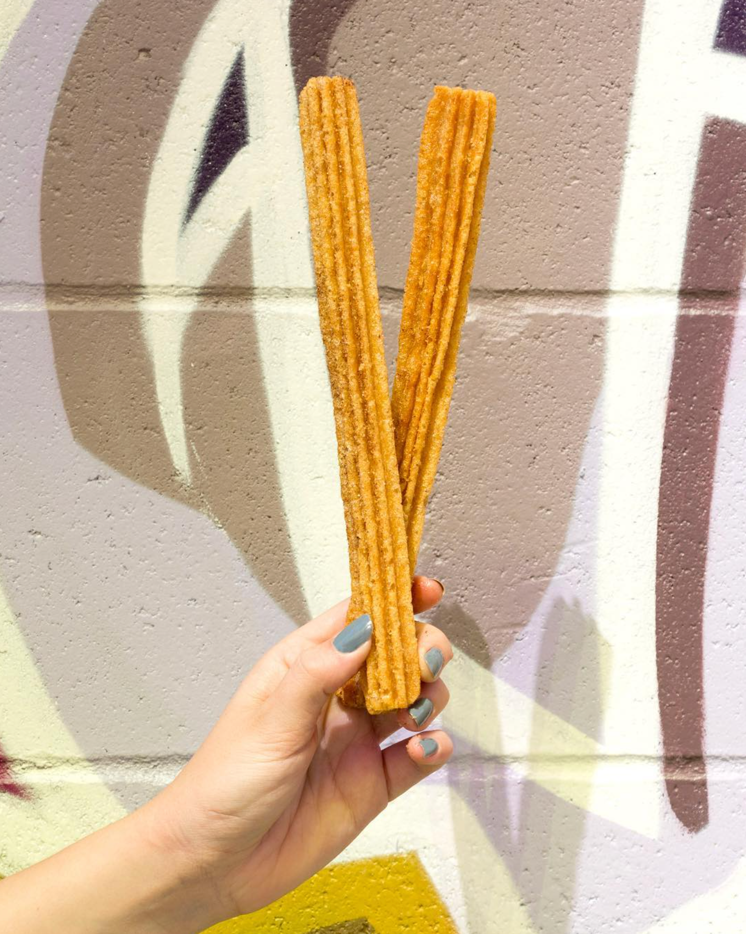
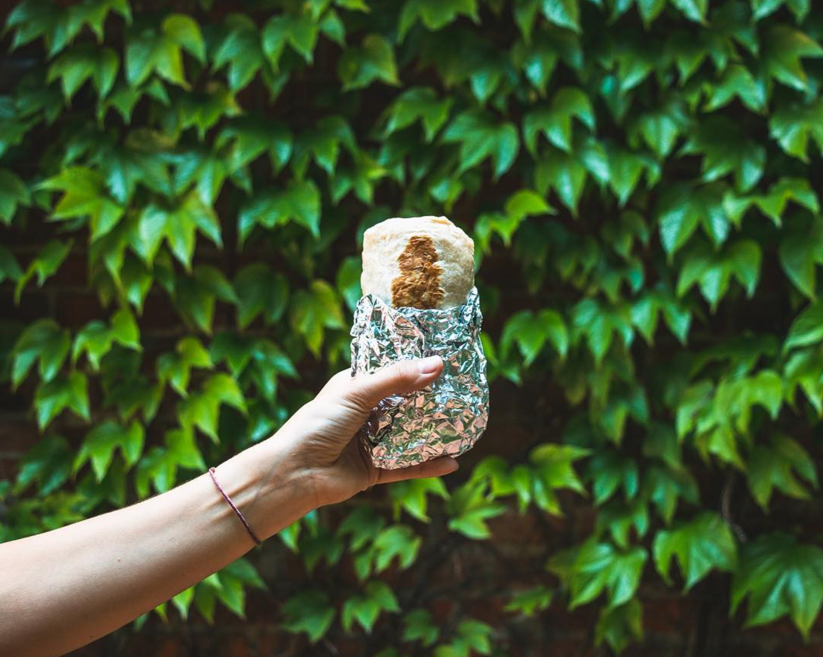
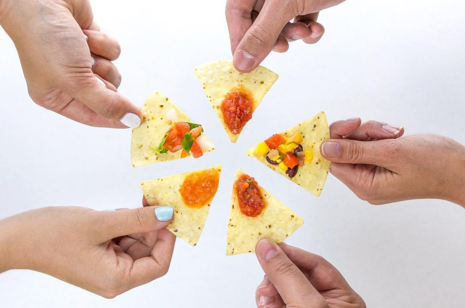
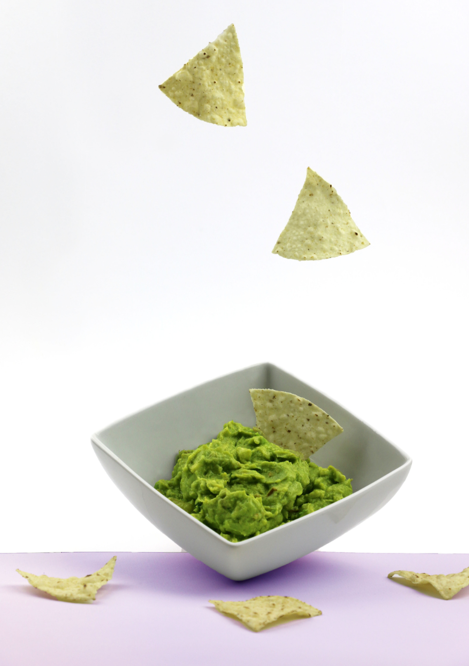
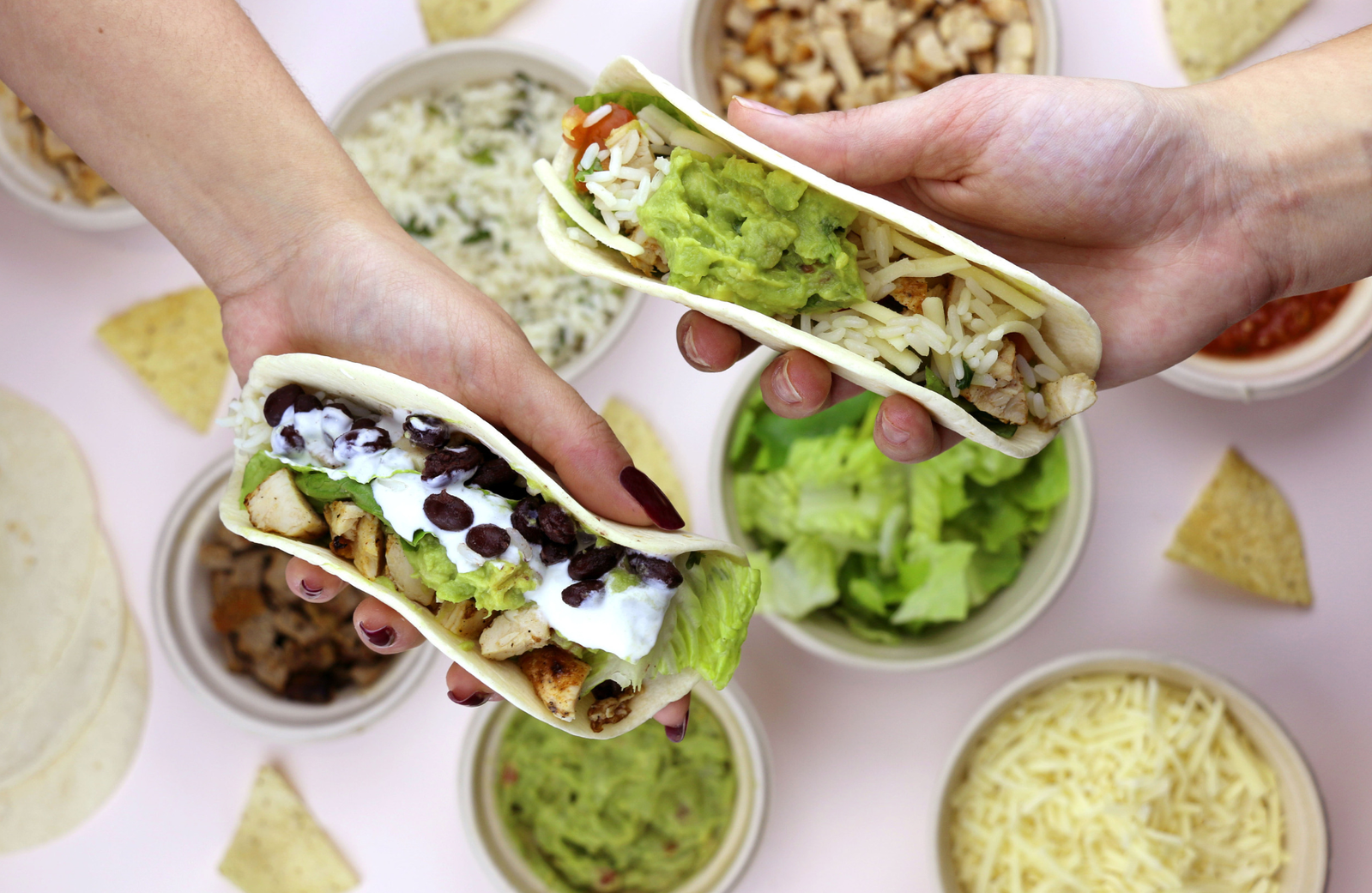
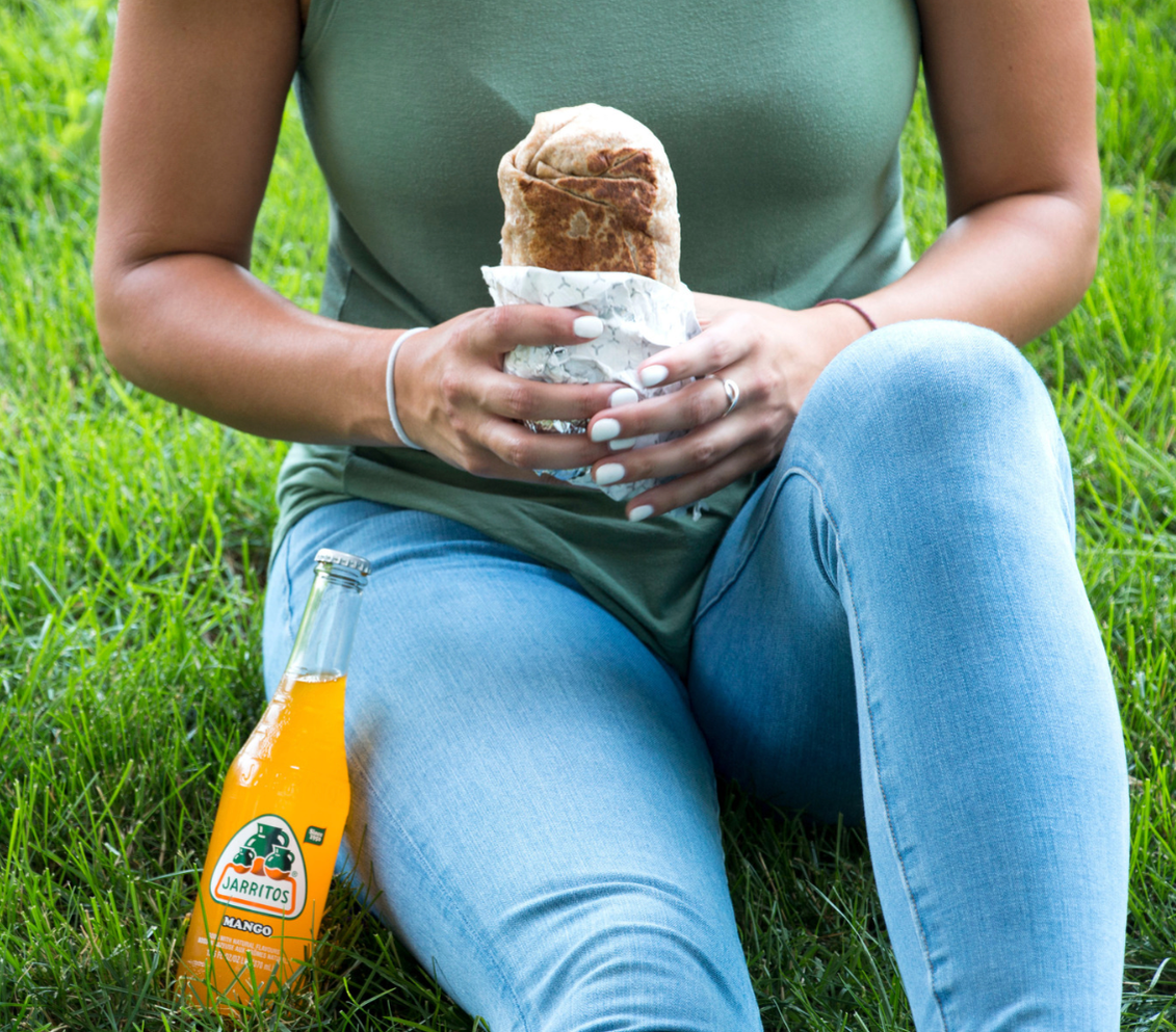
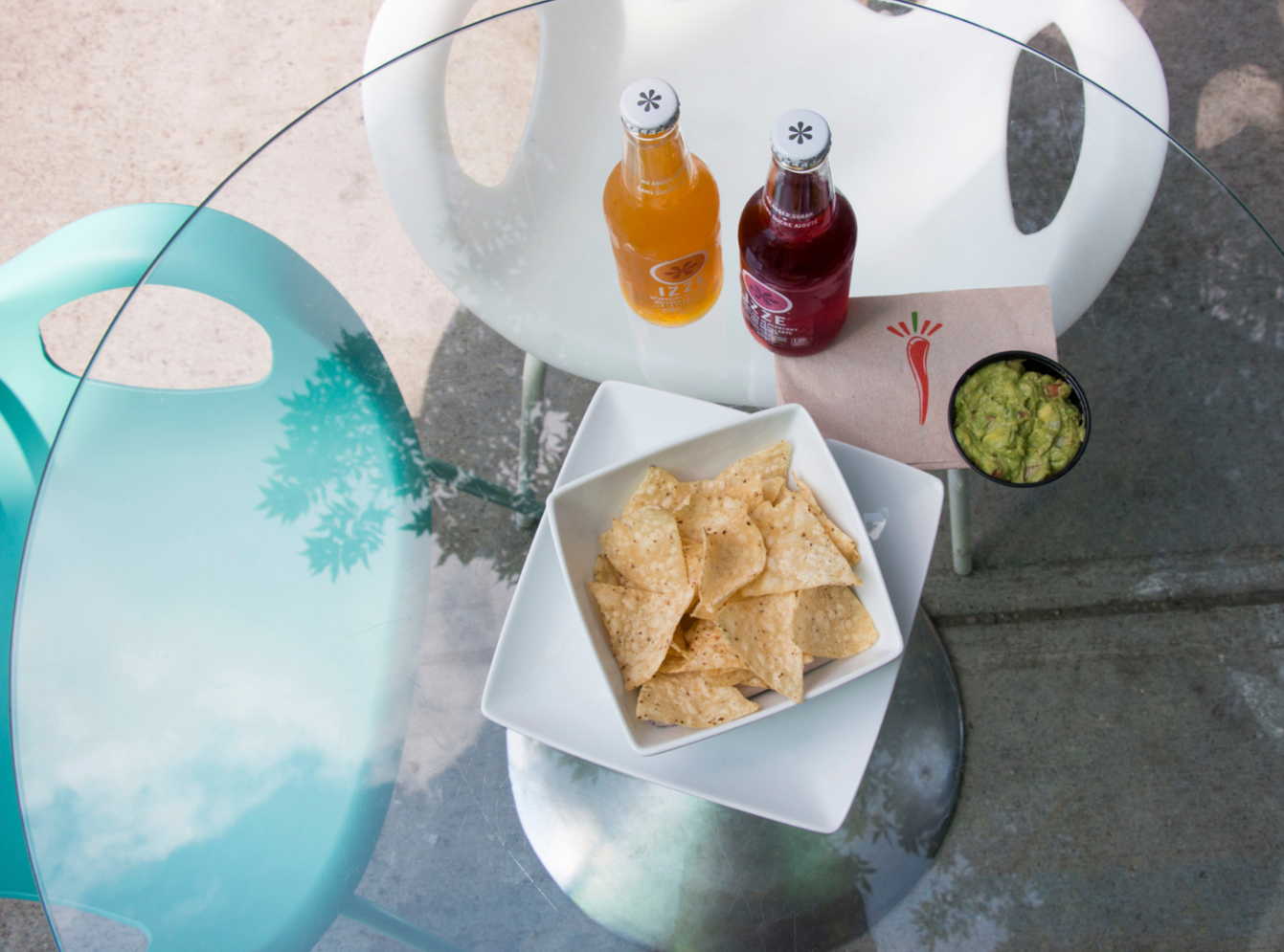
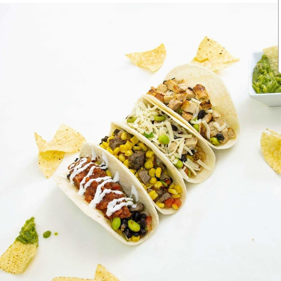
Doing away with the dark walnut and burlap surfaces of the past, I produced, planned, prop styled, and art directed a new menu photoshoot with bright, natural textures and designed all new brand assets, down to the burri-toes.
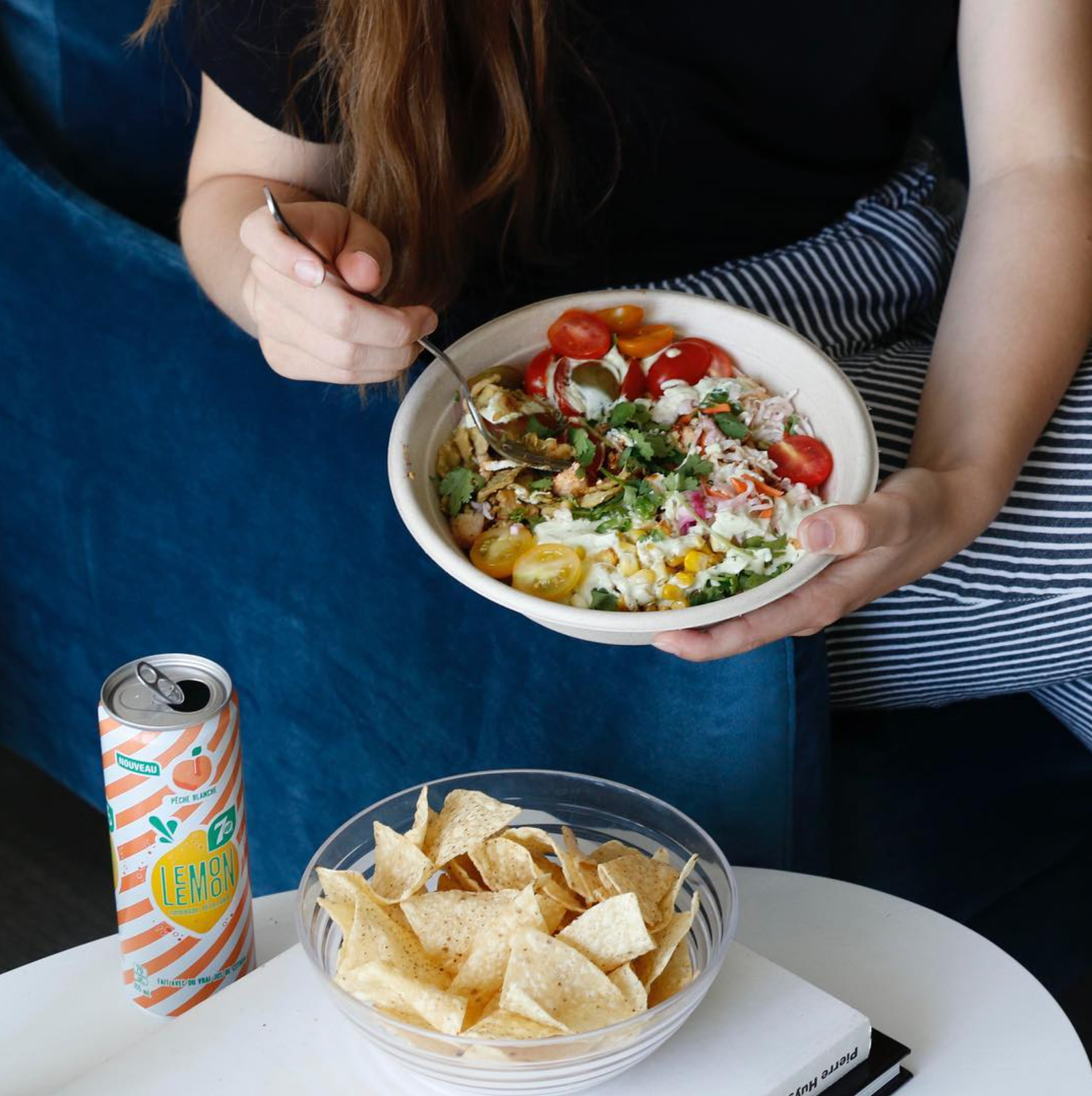
Finally, I was then given the responsibility of coordinating, purchasing, styling, shooting, and retouching all of their social content using their new visual identity.
Although I look back on this project with a healthy level of cringing that signifies growth as a designer, I'm proud of the tenacity, talent, and scrappiness it took to pull all of this off and that it was proven successful at the time with a 15% increase in sales.